Overview
What is Rayon?
Rayon is a Python library and set of tools for generating basic two-dimensional statistical visualizations. Rayon can be used to automate reporting; provide data visualization in command-line, GUI or web applications; or do ad-hoc exploratory data analysis.
Rayon can generate visualizations in PDF, PNG, SVG and PostScript formats. It can also be used in wxPython GUI applications.
Rayon has a minimal set of dependencies, to simplify deployment in environments with significant change control requirements.
Installing
Rayon requires the following software packages:
- Python 2.4 or later
- The third party renderer of your choice. For GUI apps, Rayon uses wxPython (tested on 2.8.9+). For static output (PDF, PNG, SVG and PostScript), Rayon requires Cairo 1.2.4 or later, and PyCairo (tested with 1.2, 1.4 and 1.8).
Rayon is distributed as a tarball generated by Python distutils. To install, extract the archive and run setup.py, as in the following example (replacing 1.0, with whatever Rayon version – usually the most current – you’re installing):
$ tar xzf rayon-1.0.tar.gz
$ cd rayon-1.0
$ python setup.py help    # to see options
$ python setup.py install # to install
More detailed information on using setup.py is available from the Python distutils documentation.
Command-line Tools
Rayon is primarily a Python library. However, it also comes with a (currently small) suite of command-line tools that illustrate its capabilities and to provide value without writing Python code.
The following Python scripts come installed with Rayon and provide specific visualization capabilities at the command-line.
- ryscatterplot
- Plots pairs of data elements against each other in a scatterplot.
- rystripplot
- Presents multiple time series next to each other for easy comparison.
- ryhilbert
- Displays a set of points on a number line (typically IP network addresses) on a space-filling Hilbert curve.
For more information on these tools, consult their man pages.
Building Visualizations in Python
The main use of Rayon is to produce visualizations using Python code. The next section shows some examples of Rayon’s use, from a simple scatterplot to a more complicated example with multiple datasets and additional styling.
A Basic Scatterplot
The following is a basic but complete example that reads data from a file and generates an image file containing a scatterplot:
from rayon import toolbox

tools = toolbox.Toolbox.for_file()

infile = "sample_in.txt"
outfile = "sample_out.png"

# Read in data
indata = toolbox.new_dataset_from_filename(
    infile)

# Define the chart
chart = tools.new_chart("square")
plt = tools.new_plot("scatter")
plt.set_data(x=indata.column(0),
             y=indata.column(1))
chart.add_plot(plt)
c.set_chart_background("white")

# Draw the chart
page = tools.new_page_from_filename(
    outfile, width=400, height=400)
page.write(chart)
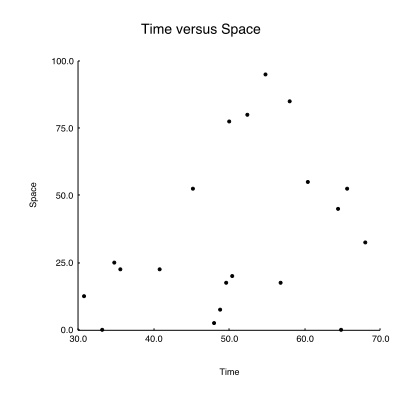
Depending on the data passed in sample_in.txt, A (very) basic scatterplot shows what the resulting scatterplot might look like.

A (very) basic scatterplot
Adding Borders and Titles
Although the previous example is sparse, it could be used out of the box to quickly visualize some data. However, some labels would be useful to give the data context. Also, given the sparseness of our data, we can make the dots larger for readability:
from rayon import toolbox

tools = toolbox.Toolbox.for_file()

# Read in data
indata = toolbox.new_dataset_from_filename(
    "sample_in.txt")

# Define the chart
chart = tools.new_chart("square")
plt = tools.new_plot("scatter")
plt.set_data(x=indata.column(0),
             y=indata.column(1))
# -- Change default marker size
plt.set_scales(marker_size=3)
chart.add_plot(plt)
c.set_chart_background("white")

# Add borders
# -- Horizontal bottom border
xmarker = tools.new_labeled_marker(
    marker=tools.new_marker('vline'),
    labeler=tools.new_labeler(halign="right"),
    label_position="e")
xticks = tools.new_tickset_from_spec(
    'default', tick_spec="n(5)",
    col=indata.column(0),
    scale=plt.get_scale("x"),
    labeledmarker=xmarker)
xborder = tools.new_border(
    "hline",
    ticksets=[xticks],
    tpad="5px")
xlabel = tools.new_border("hlabel", label="Time")
chart.add_bottom_border(xborder, height=.10)
chart.add_bottom_border(xborder, height=.06)
# -- Vertical left border
ymarker = tools.new_labeled_marker(
    marker=tools.new_marker('hline'),
    labeler=tools.new_labeler(halign="center"),
    label_position="s")
yticks = tools.new_tickset_from_spec(
    'default',
    tick_spec="n(5)",
    col=indata.column(1),
    scale=plt.get_scale("y"),
    labeledmarker=ymarker)
yborder = tools.new_border(
    "vline",
    ticksets=[yticks],
    rpad="5px")
ylabel = tools.new_border("vlabel", label="Space")
chart.add_left_border(yborder, width=.10)
chart.add_left_border(ylabel, width=.06)

# Add title
title = tools.new_border(
    "hlabel",
    label="Time versus Space",
    font_size="large")
chart.add_top_title(title, width=.10)


# Add padding
chart.add_padding("all", "20px")

# Draw the chart
page = tools.new_page_from_filename(
    outfile,
    width=400,
    height=400)
page.write(chart)
The visualization generated from this code would look like the the one in A slightly more advanced scatterplot.
A slightly more advanced scatterplot
Gridlines and Additional Data
Finally, we enhance our example by plotting additional data and by adding a gray background and a grid. We’ll also split out border creation (to make the code more readable), and put the main chart creation in a function of its own:
from rayon import toolbox

def build_axis_border(tools, bdr_type, mkr_type,
                      lbl_halign, lbl_pos, col, scale, **padding)
    marker = tools.new_labeled_marker(
        marker=tools.new_marker(mkr_type),
        labeler=tools.new_labeler(halign=lbl_halign),
        label_position=lbl)
    ticks = tools.new_tickset_from_spec(
        'default', tick_spec="n(5)",
        col=col, scale=scale,
        labeledmarker=marker)
    return tools.new_border(
        bdr_type, ticksets=[ticks],
        **padding)

def build_left_border(tools, col, scale, padding):
    return build_axis_border(
        tools, "vline", "hline", "right", "e",
        col, scale, rpad=padding)

def build_top_border(tools, col, scale, padding):
    return build_axis_border(
        tools, "hline", "vline", "center", "s",
        col, scale, tpad=padding)

def build_chart(tools, indata)
    chart = tools.new_chart('square')

    p1 = tools.new_plot('scatter')
    p1.set_data(x=indata.column(0),
                y=indata.column(1))
    p1.set_scales(marker_color='black',
                  marker_size=3)
    chart.add_plot(p1, "p1")

    p2 = tools.new_plot('scatter')
    p2.set_data(x=indata.column(0),
                y=indata.column(2))
    p2.set_scales(marker_color='red',
                  marker_size=3)
    chart.add_plot(p2, "p2")

    xborder = build_bottom_border(
        tools, indata.column(0),
        chart.get_scale("x"), "5px")
    chart.add_bottom_border(xborder, height="5px")

    yborder = build_left_border(
        tools, indata.column(1),
        chart.get_scale('x'), "5px")
    chart.add_left_border(yborder, width="5px")

    hgridlines = tools.new_gridlines_from_border(
        'horizontal', xborder)
    hgridlines.set_scales(line_color='white')
    chart.add_rear_gridlines(hgridlines)

    vgridlines = tools.new_gridlines_from_border(
        'vertical', yborder)
    vgridlines.set_scales(line_color='white')
    chart.add_rear_gridlines(vgridlines)

    chart.add_top_title(tools.new_border(
            'hlabel',
            label="Scatterplot Example")

    chart.set_plot_background("gray")
    chart.set_chart_background("white")
    chart.set_padding(allpad="25px")
    return chart

tools = toolbox.Toolbox.for_file()
indata = toolbox.new_dataset_from_filename(
    "sample_in.txt")
chart = build_chart(tools, indata)
page = tools.new_page_from_filename(
    outfile, width=400, height=400)
page.write(chart)
A scatterplot with a backgroun and multiple data series shows what the resulting scatterplot might look like.
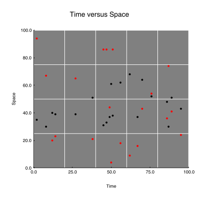
A scatterplot with a backgroun and multiple data series
Once a function like build_chart in the above example is written, it can be used in a variety of contexts:
- A cron script that generates nightly reports
- A CGI script
- A GUI application
- A module where it can be available to colleagues or a broader user community
The visualization technique is available to many different audiences to use in whatever way and on whatever data they choose.
