Building Visualizations
This chapter describes the core building blocks of Rayon. The chart contains and lays out all the elements of a Rayon visualization. The most important component of a data visualization in Rayon is usually the plot; one or more can go in the center of the chart.
Rendering
The Page object represents a surface on which a chart will draw a visualization. To create a Page object, call the new_page_from_buffer or new_page_from_filename. The Page object has a single method, Page.write, which takes a chart and visualizes it on the drawing surface:
# t is a Toolbox object
c = t.new_chart('square')
# ...configure c...
p = t.new_page_from_filename(
    "foo.png", width=400, height=200)
p.write(c)
A chart can be written to multiple outputs by passing it to multiple Page objects. This can be done to save a chart in a GUI as a file, for instance.
Charts
Charts are laid out in a series of boxes, as in The chart layout model.
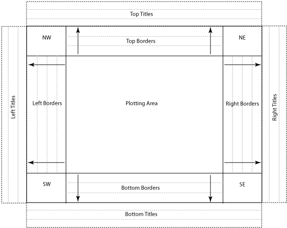
The chart layout model
Each box can contain one or more visual components, such as a plot or border.
At the center is the plotting area; plots added to the chart drawn here; how they are laid out varies between the different chart types. The user can also insert grid lines and background/foreground colors or images into a square chart.
The corners of the chart may also contain plots, if desired. The width and height of the corners are a function of the borders along their edges; if borders don’t exist along both dimensions of a corner, the corner has zero area and won’t be displayed.
Around the plotting area’s edges are the top, bottom, left and right border areas. borders added to the chart are laid out here in the order they were added, from the center outward. (That is, borders added via add_top_border are rendered above the plotting area, bottom to top; borders added via add_bottom_border are rendered below the plotting area, top to bottom.) There is no explicit limit to the number of borders a chart may have; the plotting area will shrink as necessary to accomodate them.
Outside both the borders and corners are the title areas. These areas are identical to the border areas, but span across the corners. They are more appropriate for chart-wide titles, as borders placed in them will center across the whole chart, not just the plot area.
Padding
Each component placed in a box may contain padding. Padding may also be added to the chart itself.
Padding Objects in the Chart
Most methods that add objects to a chart take padding arguments. The four padding arguments are tpad, bpad, lpad and rpad. These take size specifications (see Specifying Size and Distance) quantifying the amount of top-, bottom-, left- and right-edge padding, respectively.
The following code illustrates the use of padding arguments, and demonstrates the interaction between padding and other spacing arguments, like width and height:
# t is a Toolbox object
# c is a chart
b = t.new_border('hline', bpad="5px")
c.add_top_border(b, height="10px")
p = t.new_plot('scatter')
c.add_plot(p, lpad="3px")
In the above example, the chart will allocate ten pixels of height to the border. The border will only use five pixels of that space, reserving the rest for padding at the bottom of its bounding box. The box containing the plot will also be padded by three pixels on its left side.
Padding the Chart
The chart itself can also be padded. Use set_padding to change the amount of whitespace around the edges of the chart. The following puts ten pixels of whitespace on each edge of the chart:
c.set_padding(tpad="10px", bpad="10px",
              lpad="10px", rpad="10px")
tpad, bpad, lpad and rpad refer to the padding of the top, bottom, left and right edges, respectively, as when padding objects in the chart. Additionally, the allpad argument is a shorthand for padding on all edges. The previous example could also be written as:
c.set_padding(allpad="10px")
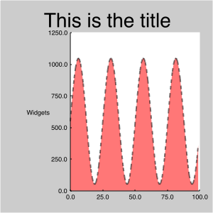
A chart with no padding and A chart with padding illustrate the use of chart padding. The first has no padding.
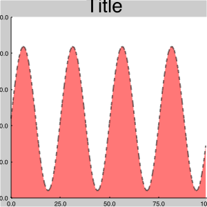
A chart with no padding
Note that the plot extends all the way to the right edge of the image – there is zero right border. The left side is similarly tight; some of the labels on the left (and the rightmost label on the bottom) have been clipped.
A chart with padding has 25 pixels of padding on all sides. The overall visual effect is more pleasant, and nothing is clipped.
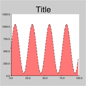
A chart with padding
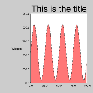
Adding Borders and Titles
Borders can be added to the edges of a chart. The following is an example of adding a border to the top of a chart:
# t is a Toolbox object
# c is a chart
b = t.new_border('hlabel', label="Title",
                           font_size="x-large")
c.add_top_border(b, height="50px")
add_top_border takes a border and a size specification of the width or height of the border being added. (See Specifying Size and Distance.)
A comparable set of methods exists for adding borders to the plot as titles. Title areas span across the whole chart, where border areas only span the plotting area.
The next example adds the border above as a title:
b = t.new_border('hlabel, label="Title",
                          font_size="x-large")
c.add_top_title(b, height=.10)
Title added as a border, centered over the plotting area shows the difference in layout between adding a border and adding a title. The first image contains a centered label as a border, added using add_top_border.
Title added as a border, centered over the plotting area
The label is centered over the plot area. To center it over the whole chart (including the left border), use add_top_title instead, as in Title added as a title, centered over the whole chart.
Title added as a title, centered over the whole chart
Adding Gridlines
Grid lines can be added to the plotting area to add reference lines or grids. Grid lines can be added to both the front and rear of the plotting area:
# t is a toolbox. c is a chart. b is a border
vgrid = t.new_gridlines_from_border(b)
c.add_rear_gridlines(vgrid)
In Chart with rear gridlines, black lines have been added to the chart using add_rear_gridlines.
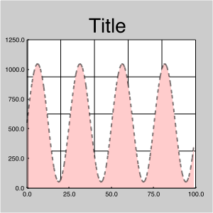
Chart with rear gridlines
Chart with front gridlines is constructed identically to the previous one, except that the lines have been added to the chart using add_front_gridlines.
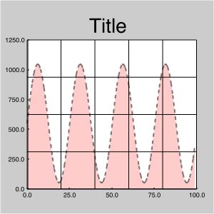
Chart with front gridlines
Adding Plots
The add_plot method adds a plot to a chart’s plotting area. How the plot is laid out depends on the type of chart you are using.
square charts
The square chart treats the plotting area as a series of layers. Successive calls to add_plot or add_chart add new plots and charts to the plotting area, to be drawn on top of previously-added objects.
Two plots in a square chart, red added first illustrates how the order in which plots are added influences display. In the first image, the red plot is added before the blue one. Contrast this figure with Two plots in a square chart, blue added first., the blue plot is added first.
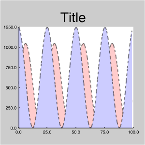
Two plots in a square chart, red added first
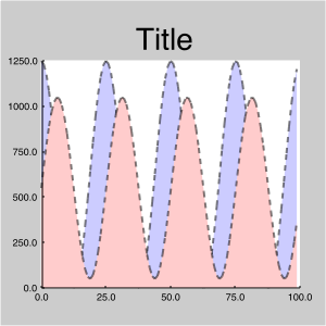
Two plots in a square chart, blue added first
The square object also has an add_chart method, which adds a chart to the plotting area in the same way.
tiled and tiled_adv charts
The tiled and tiled_adv charts divide the plotting area into a series of cells, filling each cell with plots and charts in the order in which they were added. It is generally more useful to add charts rather than plots to tiled and tiled_adv charts, as you can associate gridlines, borders and other decorations with the individual subcharts.
Adding charts to a tiled chart illustrates adding a square chart to a tiled chart. Axis lines and labels have been added to each subchart; the first subchart also shows the scale limits (which are shared by all the subcharts).
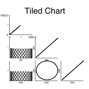
Adding charts to a tiled chart
Plots
Plots are the main way to visualize data in Rayon. A plot contains a set of axes. A fully-specified axis consists of a name (or axis label), a column of data, a scale for the data. It also contains the logic to draw a picture using the axes.
The following is the simplest use of a object (in this case, a scatter plot); associate data with axes, and add the plot to a chart:
# t is a toolbox. d is a dataset. c is a chart.
p = t.new_plot('scatter,
               x_data=d.column(0),
               y_data=d.column(1))
c.add_plot(p)
Setting data and scales
In order to use a plot, it is necessary to configure the plot with data to display and scales to transform the data into something drawable.
There are two ways to set axis data and scales. When a plot is created, axis data and scales can be set by passing special arguments to rayon.toolbox.Toolbox.new_plot. Each argument consists of an axis label and either the words scale or data, separated by an underscore. In the following example, x_data and y_data are setting the data component of the x and y axes:
# t is a toolbox. d is a dataset.
p = t.new_plot('scatter',
               x_data=d.get_column(0),
               y_data=d.get_column(1))
Data and scales may also be associated with axes after the object is created, with the set_data and set_scales methods:
# t is a toolbox. d is a dataset.
p = t.new_plot('scatter')
p.set_data(x=d.get_column(0), y=d.get_column(1))
# Add a log scale to Y
p.set_scales(y=t.new_scale('log'))
A scale argument will also accept a constant value that will be used for every point. The following example sets all points in the scatter plot to blue:
# t is a toolbox. d is a dataset.
p = t.new_plot('scatter',
               x_data=d.column(0),
               y_data=d.column(1),
               marker_color_scale="blue")
More Information
A full list of the plot objects that come with Rayon is available in the Plots section of the Rayon Reference Manual.
Scales
Scales are used to convert data in a visualization into a set of coordinates. These coordinates are used by plots and borders to draw points on the chart.
Rayon provides several scales that commonly appear in visualization – linear and log scales, categorical scales and scales that map numeric ranges to color gradients, among others. However, scales can be functions. A scale function takes an argument (a piece of data) and returns a value that can be used by the plot to display data on the associated axis. The following function implements a simple linear scale that could be used as the x or y axis of a scatter plot:
# input_max is the largest
# value of x we plan to see
def linear_scale_func(x):
    return float(x) / float(input_max)
To determine what kind of data a plot expects on a given axis, consult the documentation for that object. For instance, the x axis of the scatter plot takes a value between 0 and 1, so linear_scale_func would work for all positive values of x less than or equal to input_max. (For a more robust version of this scale that can handle negative numbers, see the linear scale.)
Changing Limits
Many scales have natural limits to the data they can transform. The scales that come with Rayon will, by default, grow and shrink their limits to cover the data associated with it. This behavior can be changed in two ways. The first is to specify limits when the scale is created:
# t is a toolbox
s = t.new_scale('linear', 10, 20)
This will create a linear scale whose lowest point is 10 and highest is 20. These limits will not change, even if the data exceeds them; it is a fixed scale.
To provide initial limits to a scale, but allow the scale to adjust its limits if necessary, pass it the fixed argument with a value of False:
s = t.new_scale('linear', 10, 20, fixed=False)
Rayon will not create a fixed scale unless the limits are fully specified when the scale is created; the following three statements create unfixed scales, even though no fixed argument is passed:
s = t.new_scale('linear')
s = t.new_scale('linear', 10)
s = t.new_scale('linear', input_min=20)
More Information
A full list of the scale objects that come with Rayon is available in the Scales section of the Rayon Reference Manual.
