Plots
Plots are the core visualization object in Rayon. Plots are composed of a set of axes, which are themselves pairings of data with scales that map the data into the visualization space. Plots also contain logic for using these axes to draw a visualization. See Plots in Building Visualizations for more details.
Creating Plots
All plots are created from the Toolbox object using the new_plot method, supplying the label and arguments for the desired plot. The plots in this chapter are organized by the label used to create them in the new_plot method.
In addition to the label, calls to new_plot also take a number of arguments of the form <axis>_scale or <axis>_data, where <axis> is the name of one of the plot’s axes. The value of an <axis>_scale argument should be a scale; the value of an <axis>_data argument should be a column or an array of data of the same length as the data associated with every other axis. The following example creates a scatter plot named scatter and associates the x and y axes with scales and data:
scatter = tools.new_plot('scatter',
                         x_data=[1, 2, 3],
                         x_scale=tools.new_scale('linear'),
                         y_data=[10, 20, 30],
                         y_scale=tools.new_scale('linear'))
Default Scales and Data
If data is omitted from an axis specification, it is treated as a column of data whose values are all None. Consequently, data may only be omitted from an axis if the scale for that axis can tolerate None as an input; otherwise, an error will be generated when the visualization is rendered.
Scales may also be omitted from an axis specification, if that axis has a default scale. For instance, a scatter plot’s default scales for the x and y axes are both linear scales, so the example above could be shortened to:
scatter = tools.new_plot('scatter',
                         x_data=[1, 2, 3],
                         y_data=[10, 20, 30])
Constant Scales
If the value of an <axis>_scale argument is not callable, it is implicitly converted into a scale that transforms any input into that value. This is referred to elsewhere in this document as specifying a constant scale for the axis. For instance, the following example specifies that all points in a scatter plot be black dots 4 pixels in diameter:
scatter = tools.new_plot('scatter',
                         x_data=[1, 2, 3],
                         y_data=[10, 20, 30],
                         marker_size_scale=4,
                         marker_color_scale="black",
                         marker_shape_scale="dot")
(Note the marker_ arguments above are using default data. Constant scales can take None as input (because they ignore it). They are usually used with default data.)
The default scales for a scatter plot’s marker_size, marker_color and marker_shape axes are all constant, so it is necessary to supply neither data nor scales for them if the default values are acceptable.
Additional Arguments
A few plots take additional arguments to the ones described above. These additional arguments are described as appropriate in the plot descriptions that follow.
Plots
This section describes the plots provided by Rayon. Each subsection consists of a text description, an illustration of the plot, and a table describing the plot’s axes. Each row in the table contains the following information about an axis:
- Axis
- The axis name.
- Value
- What sort of value it expects as output from its scale.
- Rendering
- What that value means when the plot is rendered.
- Default Scale
- The default scale for the axis. If the default scale is constant, the output value of the constant scale.
bar
- toolbox.new_plot('bar', y_origin=<auto>[, ...])
- toolbox.new_plot('vbar', y_origin=<auto>[, ...])
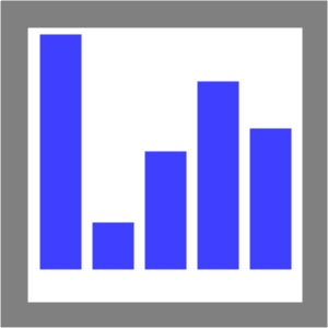
Example of a bar plot.
Draws a number of vertical bars, with the number and height of each bar determined by the data. Data can also be mapped onto the bars’ color, height, width and border color/width.
y_origin is the point at which to begin drawing the base of the bar. If data is less than this, this point on the Y axis will represent the top edge of the bar; otherwise it will represent the bottom edge. This value must only be supplied if the user is using a scale function for the Y axis; if a scale class such as linear is used, by default the origin will be the scaled value of 0 on the scale.
See also
Axes Axis Value Rendering Default Scale x A real number between 0 and 1 X (horizontal) spatial axis A catrange scale y A real number between 0 and 1 Y (vertical)) spatial axis A linear scale bar_alignment A real number between 0 and 1. 0 == full left, 1 == full right. Alignment of bar in allotted region. .5 bar_color A color specification (see Specifying Colors) Interior color of the bar. #0000FFC0 border_color A color specification (see Specifying Colors) The border color of the bar. #000000FF bar_width A real number between 0 and 1 The proportion of the range specified by x that should be filled with the bar. 0 == no width; 1 == full range. 1 border_width Integer size (in points/pixels) Size of the border. 0 bar_fixup True or False If True, align bar edges on pixels True
field
- toolbox.new_plot('field'[, fill_color="#9999eecc", ...])
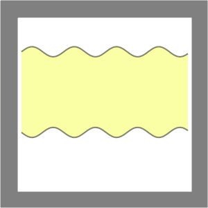
Example of a field plot.
Draws a visualization similar to that drawn by a line plot. However, a field plot draws two lines. Each line shares values for the X axis, but has different values for Y. The area between the two lines (the “field”) is shaded.
fill_color is a color specification (see Specifying Colors) of the color of the shading.
Axes Axis Value Rendering Default Scale x A real number between 0 and 1 X (horizontal) spatial axis A linear scale y1 A real number between 0 and 1 The Y (vertical)) axis for the first line A linear scale y2 A real number between 0 and 1 The Y (vertical)) axis for the second line A linear scale line_color A color specification (see Specifying Colors) Color of the line segment drawn between the last point and this one. The same line color is used for the line segment drawn for the y1 data and the one drawn for the y2 data. #0000007F line_width Integer size (in points/pixels) Width of line segment ending in this point. The same line width is used for the line segment drawn for the y1 data and the one drawn for the y2 data. 2 line_style A line style (see Lines) Style of line segment ending in this point dashed
filledline
- toolbox.new_plot('filledline'[, fill_color="#ee9999cc", ...])
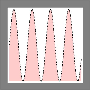
Example of a filled line plot.
Draws a line based on data specified for the X and Y axes in the style of a line plot. The area “beneath” the line (that is, in the direction of smaller values on the scale), is shaded. See also the field plot.
fill_color is a color specification (see Specifying Colors) of the shading beneath the line.
Axes Axis Value Rendering Default Scale x A real number between 0 and 1 X (horizontal) spatial axis A linear scale y A real number between 0 and 1 Y (vertical)) spatial axis A linear scale line_color A color specification (see Specifying Colors) Color of the line segment drawn between the last point and this one #0000007F line_width Integer size (in points/pixels) Width of line segment ending in this point 2 line_style A line style (see Lines) Style of line segment ending in this point dashed
hbar
- toolbox.new_plot('hbar', x_origin=<auto>[, ...])
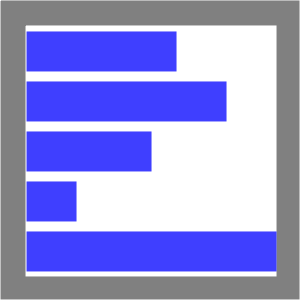
Example of a horizontal bar plot.
Plots data similarly to the bar plot, but orients the bars horizontally, from top to bottom.
Note that bar “width” in the hbar plot is the vertical dimension of the bar. The horizontal dimension is the bar “height.”
x_origin is the point at which to begin drawing the base of the bar. If data is less than this, this point on the X axis will represent the right edge of the bar; otherwise it will represent the left edge. This value must only be supplied if the user is using a scale function for the X axis; if a scale class such as linear is used, by default the origin will be the scaled value of 0 on the scale.
See also
Axes Axis Value Rendering Default Scale x A real number between 0 and 1 X (horizontal) spatial axis A linear scale y A real number between 0 and 1 Y (vertical)) spatial axis A linear scale bar_alignment A real number between 0 and 1. 0 == full left, 1 == full right. Alignment of bar in allotted region. .5 bar_color A color specification (see Specifying Colors) Interior color of the bar. #0000FFC0 border_color A color specification (see Specifying Colors) The border color of the bar. #000000FF bar_width A real number between 0 and 1 The proportion of the range specified by u that should be filled with the bar. 0 == no width; 1 == full range. 1 border_width Integer size (in points/pixels) Size of the border. 0 bar_fixup True or False If True, align bar edges on pixels True
labeledscatter
- toolbox.new_plot('labeledscatter'[, ...])
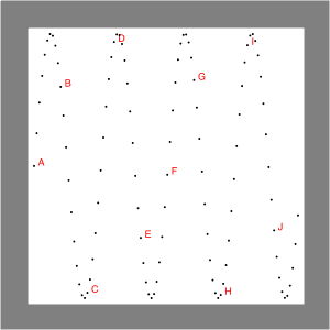
Example of a labeled scatterplot.
Draws a plot similar to that drawn by a scatter plot, but the markers may also be labeled.
By default, label data is converted to a string using str. If the label value is None or the input value cannot be converted to a string, the output value is an empty string (meaning no label is drawn).
Axes Axis Value Rendering Default Scale x A real number between 0 and 1 X (horizontal) spatial axis A linear scale y A real number between 0 and 1 Y (vertical) spatial axis A linear scale marker_color A color specification Color of the mark representing the point #000000FF marker_shape A marker shape Shape of the mark representing the point dot marker_size Integer size (in points/pixels) Size of the mark representing the point 1 text String Text of the label accompanying the marker See description label_position n, s, e, or w (See Labeled Markers) Position of the label accompanying the marker, relative to the marker ne label_spacing Integer size (in points/pixels) Space between label and marker, in points/pixels 1 font_properties dictionary Dictionary of properties of the label text {} (Empty dictionary) border_properties dictionary Dictionary of properties of the label border {} (Empty dictionary) bgcolor A color specification (see Specifying Colors) Background color of the label box #00000000
line
- toolbox.new_plot('line'[, ...])
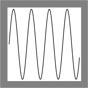
Example of a line plot.
Draws a series of Cartesian points as a “line.” (More accurately, as a connected chain of line segments. The points represent the endpoints of segments in the chain.)
Axes Axis Value Rendering Default Scale x A real number between 0 and 1 X (horizontal) spatial axis A linear scale. y A real number between 0 and 1 Y (vertical)) spatial axis A linear scale. line_color A color specification (see Specifying Colors) Color of the line segment drawn between the last point and this one #000000FF line_width Integer size (in points/pixels) Width of line segment ending in this point 2 line_style A line style (see Lines) Style of line segment ending in this point solid
scatter
- toolbox.new_plot('scatter'[, ...])
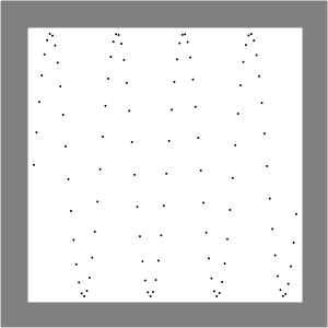
Example of a scatterplot.
Draws a plot in which data are mapped onto the X and Y axes of a Cartesian coordinate system. At these coordinates, marks are made whose shape, color and size can also be determined based on data.
Axes Axis Value Rendering Default Scale x A real number between 0 and 1 X (horizontal) spatial axis A linear scale y A real number between 0 and 1 Y (vertical)) spatial axis A linear scale marker_color` A color specification (see Specifying Colors) Color of the mark representing the point #000000FF marker_shape` A marker shape Shape of the mark representing the point dot marker_size` Integer size (in points/pixels) Size of the mark representing the point 1
